VISIT 2 SRI LANKA

Project Overview
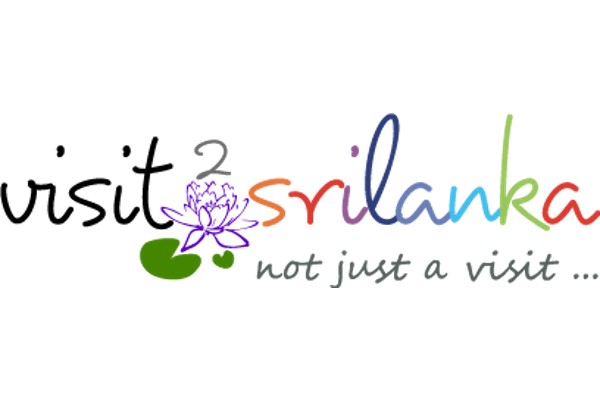
The VISIT 2 SRI LANKA logo was created to encapsulate the essence of Sri Lanka as a destination that offers a rich blend of experiences, culture, and natural beauty. The slogan “Not Just a Visit” signifies that visiting Sri Lanka is not merely a trip but an immersion into a diverse and vibrant country. The logo incorporates the national flower of Sri Lanka, the Lotus, which symbolizes purity and has deep cultural and historical significance. The use of multiple colours reflects the variety of experiences and the diversity of the country.
Strategy
1. Understanding Client’s Vision:
- Engage with the VISIT 2 SRI LANKA team to understand their vision for a logo that represents the country’s diversity and cultural richness.
- Emphasize the idea that visiting Sri Lanka offers a unique and multifaceted experience beyond just sightseeing.
2. Audience Analysis:
- Target both international tourists and local residents, ensuring the logo resonates with a broad audience.
- Highlight the cultural heritage, natural beauty, and variety of experiences Sri Lanka offers.
3. Brand Identity:
- Establish VISIT 2 SRI LANKA as a leading authority in the tourism sector with a memorable and representative logo.
- Ensure the logo aligns with the brand’s mission to provide a comprehensive travel guide that showcases Sri Lanka’s richness.
Design
1. Symbolism:
- Integrate the Lotus flower into the design due to its cultural and historical significance in Sri Lanka.
- Use the Lotus to symbolize purity, beauty, and the spiritual heritage of Sri Lanka.
2. Colour Palette:
- Utilize a vibrant and diverse colour palette to represent the various experiences and the multicultural fabric of Sri Lanka.
- Each colour in the logo signifies different aspects of the country, from its lush landscapes to its rich traditions.
3. Typography:
- Choose a font that is modern yet reflects the traditional elegance of Sri Lanka.
- Ensure the text is legible and complements the visual elements of the logo.
4. Composition:
- Create a balanced composition where the Lotus flower and the text “VISIT 2 SRI LANKA” are harmoniously integrated.
- Ensure the slogan “Not Just a Visit” is positioned to reinforce the message of a comprehensive and enriching experience.
5. Versatility:
- Design the logo to be versatile and adaptable across various platforms, including digital and print media.
- Ensure it looks good in different sizes and maintains clarity and impact.
Final Design
Logo Elements:
- Lotus Flower: Central element symbolizing purity and the rich cultural heritage of Sri Lanka.
- Multi-coloured Text: Reflects the diversity and variety of experiences in Sri Lanka.
- Slogan “Not Just a Visit”: Positioned to emphasize the immersive and multifaceted nature of a trip to Sri Lanka.
By focusing on these strategic and design aspects, the VISIT 2 SRI LANKA logo effectively communicates the essence of the country as a destination that offers much more than just a visit. The logo aligns with the brand’s mission to provide a comprehensive platform that showcases Sri Lanka’s diversity, culture, and natural beauty.
