VISIT 2 AUSTRALIA

Project Overview
VISIT 2 AUSTRALIA is a comprehensive travel guide and premier directory for tourism in Australia. As the first of its kind, VISIT 2 AUSTRALIA aims to offer a complete platform that caters to the diverse needs of both visitors and residents. The logo for VISIT 2 AUSTRALIA was designed to reflect the country’s rich diversity, vibrant culture, and the multitude of experiences it offers. The slogan, “Not Just a Visit,” emphasizes that visiting Australia is an immersive experience encompassing various facets of life and culture.
Logo Concept
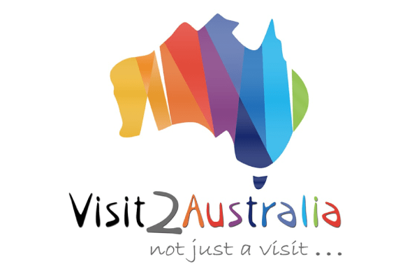
The VISIT 2 AUSTRALIA logo features a colourful and dynamic representation of Australia. The use of multiple colours signifies the diverse nationalities living in Australia and the wide range of experiences the country offers. The design encapsulates the essence of Australia as a melting pot of cultures, natural wonders, and unique adventures, reinforcing the message that visiting Australia is much more than just a trip.
Strategy
1. Understanding Client’s Vision:
- Conducted in-depth discussions with the VISIT 2 AUSTRALIA team to grasp their vision and goals for the logo.
- Identified the need to portray Australia as a diverse, vibrant, and inclusive destination.
2. Audience Analysis:
- Analysed the target audience, including international tourists and local residents, to ensure the logo resonates with a broad spectrum of individuals.
- Focused on creating a design that appeals to people seeking a comprehensive and enriching travel experience.
3. Brand Identity:
- Aimed to establish VISIT 2 AUSTRALIA as a leading authority in the tourism sector by creating a memorable and recognizable logo.
- Ensured the logo aligns with the brand’s mission to provide a holistic and all-encompassing travel guide.
Design
1. Colour Palette:
- Utilized a vibrant colour palette to symbolize the diversity and richness of Australia.
- Each colour represents different aspects of Australia, such as its multicultural population, natural beauty, and varied attractions.
2. Logo Elements:
- The map of Australia is central to the design, immediately conveying the geographical focus.
- Smooth, flowing lines and modern typography are used to create a friendly and approachable feel.
3. Typography:
- Chose a playful yet professional font to balance the seriousness of a premier directory with the excitement of travel.
- Incorporated the tagline “Not Just a Visit” to reinforce the brand’s promise of offering more than just a travel experience.
4. Versatility:
- Designed the logo to be versatile, ensuring it works well across various mediums, including digital platforms, print materials, and promotional items.
- Ensured clarity and readability at different sizes to maintain brand consistency.
5. Symbolism:
- Integrated symbolic elements that represent the essence of Australia, making the logo not only a visual identifier but also a storyteller.
- The interplay of colours and shapes aims to evoke curiosity and excitement about exploring Australia.
Final Logo:
The final logo successfully encapsulates the vibrant and diverse spirit of Australia. It serves as a strong visual identity for VISIT 2 AUSTRALIA, representing the platform’s commitment to providing an all-encompassing travel guide and directory for the tourism industry.
By focusing on these strategy and design aspects, WEBS R US PTY LTD has created a distinctive and meaningful logo that aligns with VISIT 2 AUSTRALIA’s mission and vision, setting the stage for its brand presence in the tourism sector.
